i found a article "http://www.inspirationbit.com/dos-and-donts-colour/" that i found quite good for knowledge of colour, quite a lot of things i did not know.
so i sat down and thought of all the things i could design towards colour E.G, rainbows, paint, drawing etc.
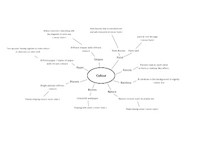
i dident really have much inspiration for this magazine. so i went with the paint spill since I'm quite confident with vector and i had a general idea of how it would look.
my next step before i even started was to think how would the paint look. i dident want a simple colour, eg, just red or blue etc, but i dident really want gradients ever. so i had a little play around with the title. the first thing that poped into my head was the paint interacting with the title. so i got this,
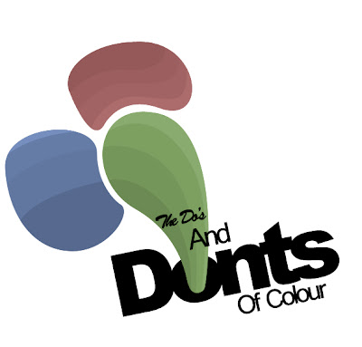
this design was after i changed the font abit, it was originally the same font all together, but i felt it dident stand out at all so i mixed it up abit. this was the first test i had with the paint idea. however i still dident like it so i added a gradient fill to give the colours something more since they was abit dull.
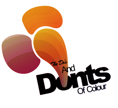
i then started to like it however, i dident feel like it looked like pain, it was more like shapes, so i deleted this and started fresh and got the following.
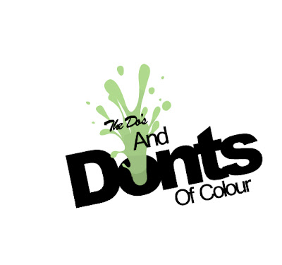
The colours was just a base print so i know how the gradient would blend with it.
Now i had the general look i was quite happy with, it was time to add the real gradient, now the good thing about this was because i used a rainbow gradient there was multiple outcomes i could of chosen. so here are afew diffrent ones.

These where not the colours i was limited to, theres millions of colours, these are just three i picked as an example.
so i went with the first one, i loved the the orange to blue with a hint of green in the center, but i felt the Donts was a bit plain. so i added some slight white highlights, to give it a slight plastic effect
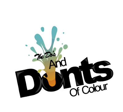
so the title i was now happy with and i had my inspiration now, so i began to design. i set the size to 2xA4 together, with a 72 res

i started by adding some more paint-like effect i allso added little white bits like the "donts" to the paint effect., i needed more design aspect to give me a idea of how the text will be layed out. i all so added a small footer at the bottom of the title that the author has writ and there name.
i had this idea to have all the text on a slight slant, to make the magazine abit more interesting rather than the strait forward down text. to i started adding text using the font
"Colaborate-Regular | Bold : 21 pt / AA: crisp | for the headers. "
"Colaborate-Regular | Normal : 11 pt / AA: crisp | for content. "
I allso had the idea of using one of the colours that where in the paint effect for the headers.
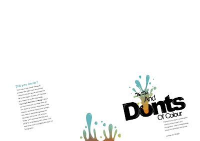
so then i started building on the design, adding more information from the article i found in bits.

i then added some more paint, but i wanted a large bit to really add the effect to the page.
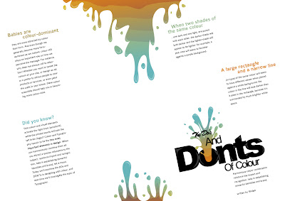
i then started to see the design form, i still felt that i needed abit more colour so i added abit more to the bottom left and some in between the text.
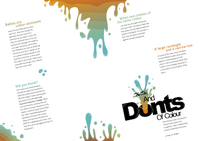
i then added the images needed for the top two right text bits, and i allso added one more text bit in for www.colourlovers.com that someone posted as a comment in this article.

i then added the last text strip in, and i was quite happy with it.
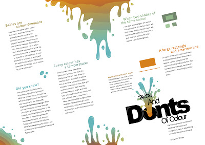
i liked the outcome, it had the information required, however i wanted to try something else. so i decided to drop the idea of slanted text strips and add just normal ones in so i did.

when i done this i manged to gain alot of extra space. and there where little strips on the website that exsplains some colours that effect you dirrently, such as red allways means angry or romance etc. so i decided to add these.. i allso changed the www.colourlovers.com to black, because i felt it made it stand out abit more.
the smaller text strips such as the effects of colour and the website.
"Colaborate-Regular | Bold : 14 pt / AA: crisp | for the headers. "
"Colaborate-Regular | Normal : 11 pt / AA: crisp | for content. "
Final
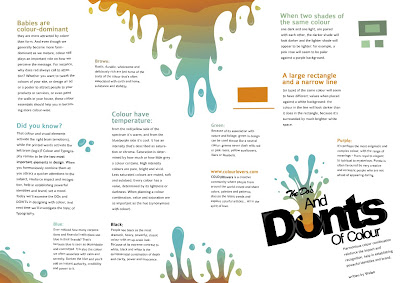
im happy with the final, i feel it may be abit to packed, but ill wait till feed back tomorrow.
